Emeera Collections - Designed to Rise
A minimal streetwear identity built on structure, elevation, and quiet confidence.
Emeera Collections is a modern streetwear brand focused on clean aesthetics, elevated basics, and timeless design. What started as a simple logo redraw evolved into a complete brand transformation — redefining the visual identity to better reflect the brand’s direction and ambition.
Client:
Emeera Collections
Scope:
Logo Design and Branding
Year:
2026
Rethinking the Starting Point
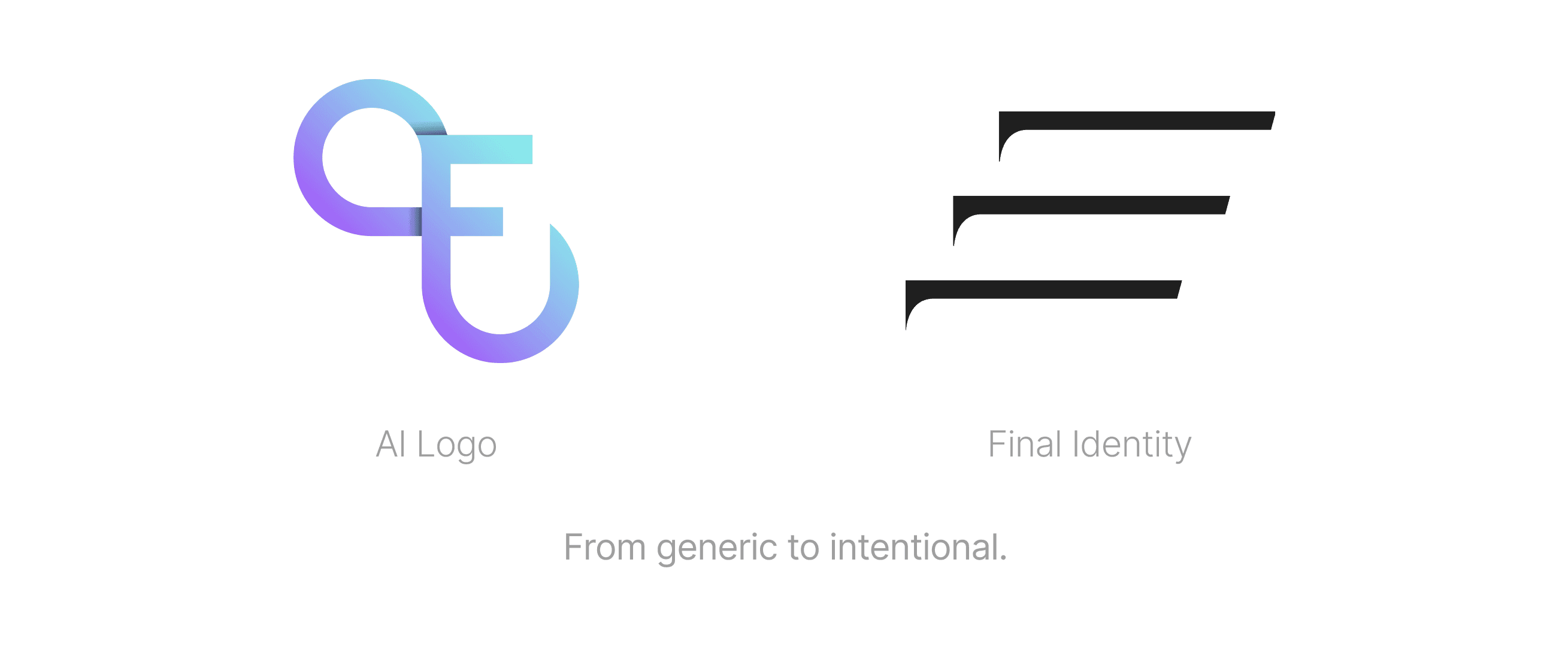
The project began with a request to refine an AI-generated logo.
While functional, the mark lacked the character and intention needed for a fashion brand — especially within the streetwear space, where identity plays a crucial role.
Instead of refining what existed, we saw an opportunity to step back and rethink the brand entirely.
What followed was a shift from execution to direction — building a visual identity that feels purposeful, minimal, and elevated.
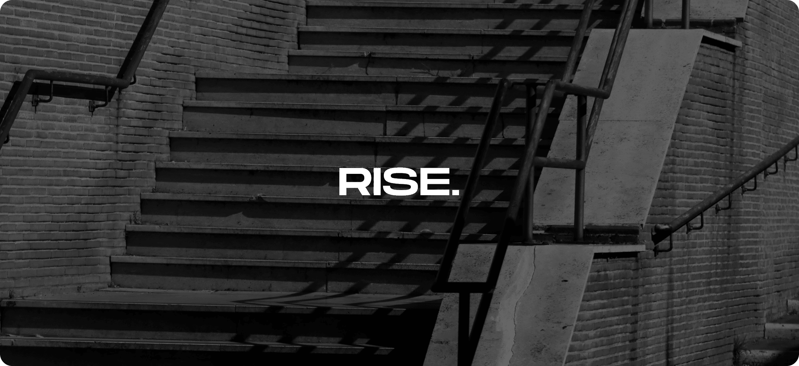
Designed to Rise
At the core of the identity lies a simple idea — elevation.
Inspired by urban stairways often seen in street environments, the concept of rising became both a visual and symbolic foundation for the brand.
The tagline “Designed to Rise” reflects this idea — not just as movement, but as growth, progression, and confidence.
It represents a brand that evolves with its audience, moving forward with clarity and purpose.
Finding the Direction
The early exploration phase focused on defining a visual language that aligns with modern streetwear culture.
The goal was to create something that feels:
Minimal yet expressive
Structured but not rigid
Contemporary with a timeless edge
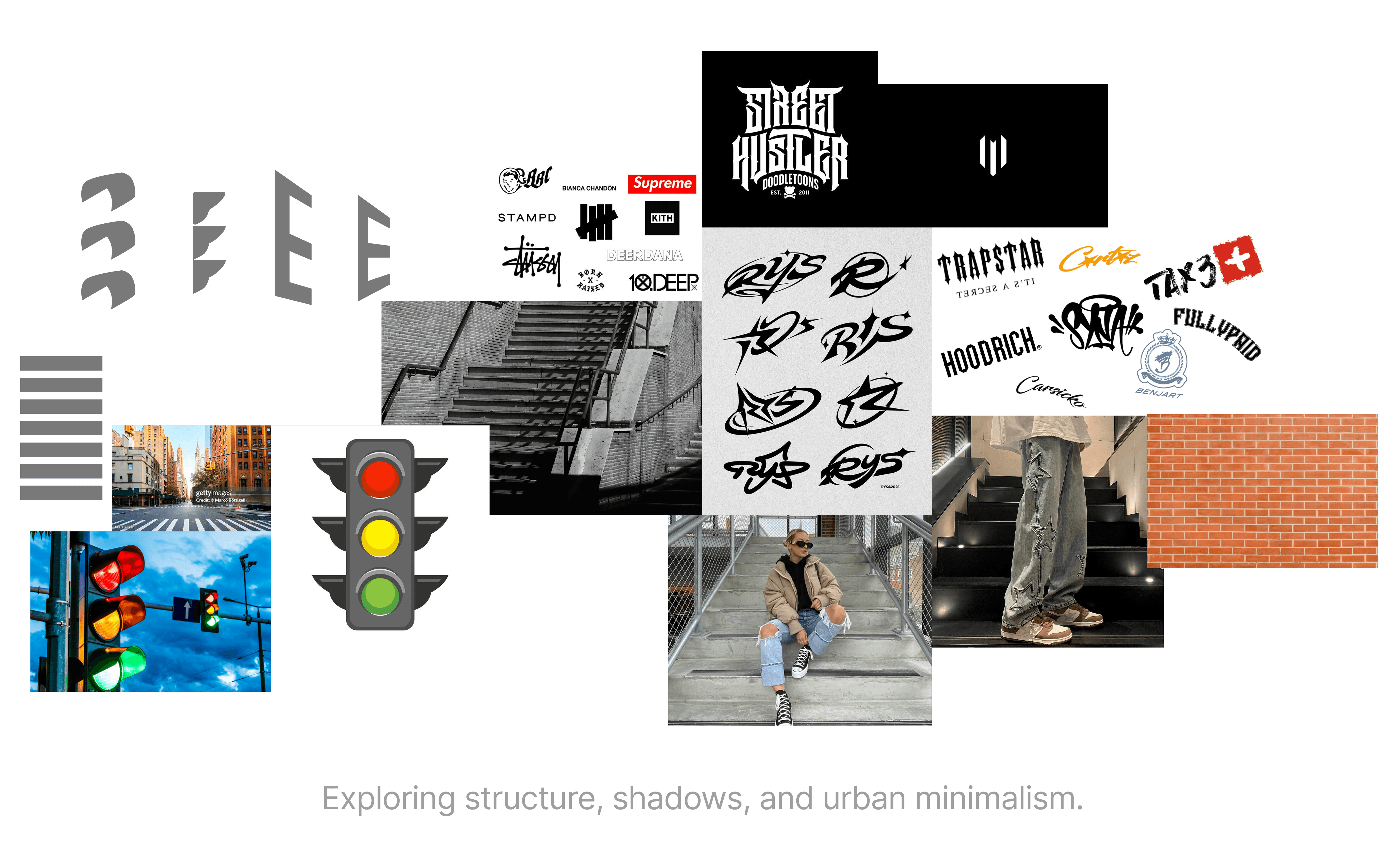
Through moodboards and visual references, the direction became clear — a brand built on form, balance, and subtle detail.
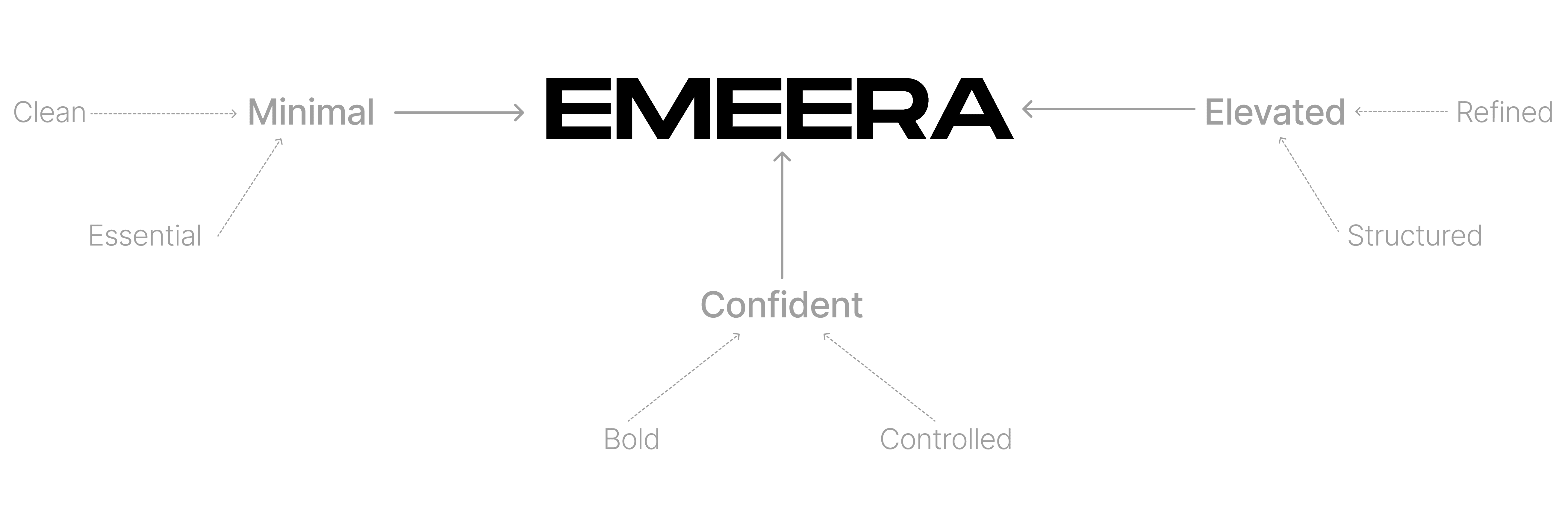
Minimal. Elevated. Confident.
The brand personality was shaped around three key attributes:
Building the Symbol
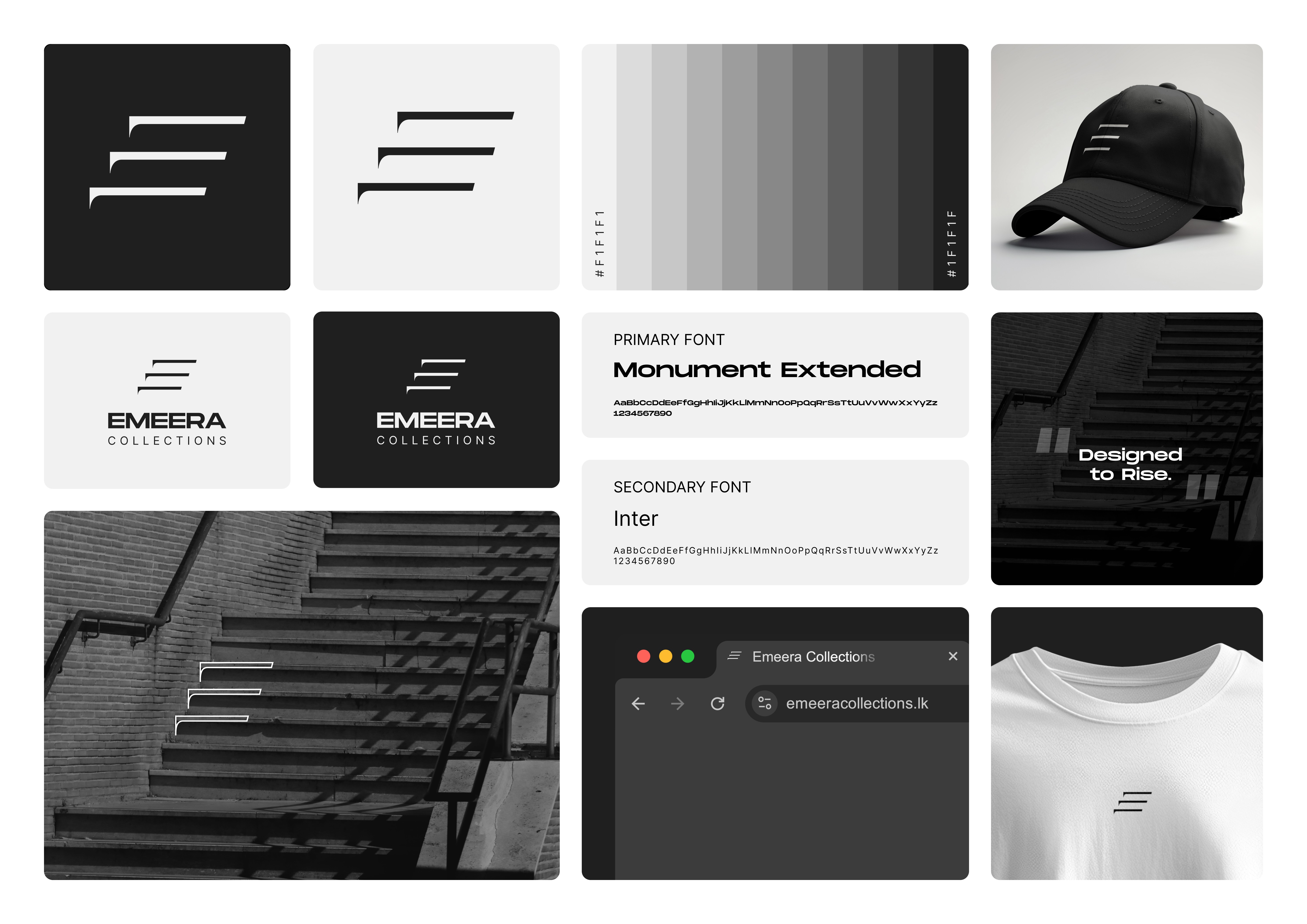
The logo mark is constructed using stacked horizontal lines, forming an abstract representation of the letter E.

The structure is directly inspired by stairs, reinforcing the concept of upward movement and progression.
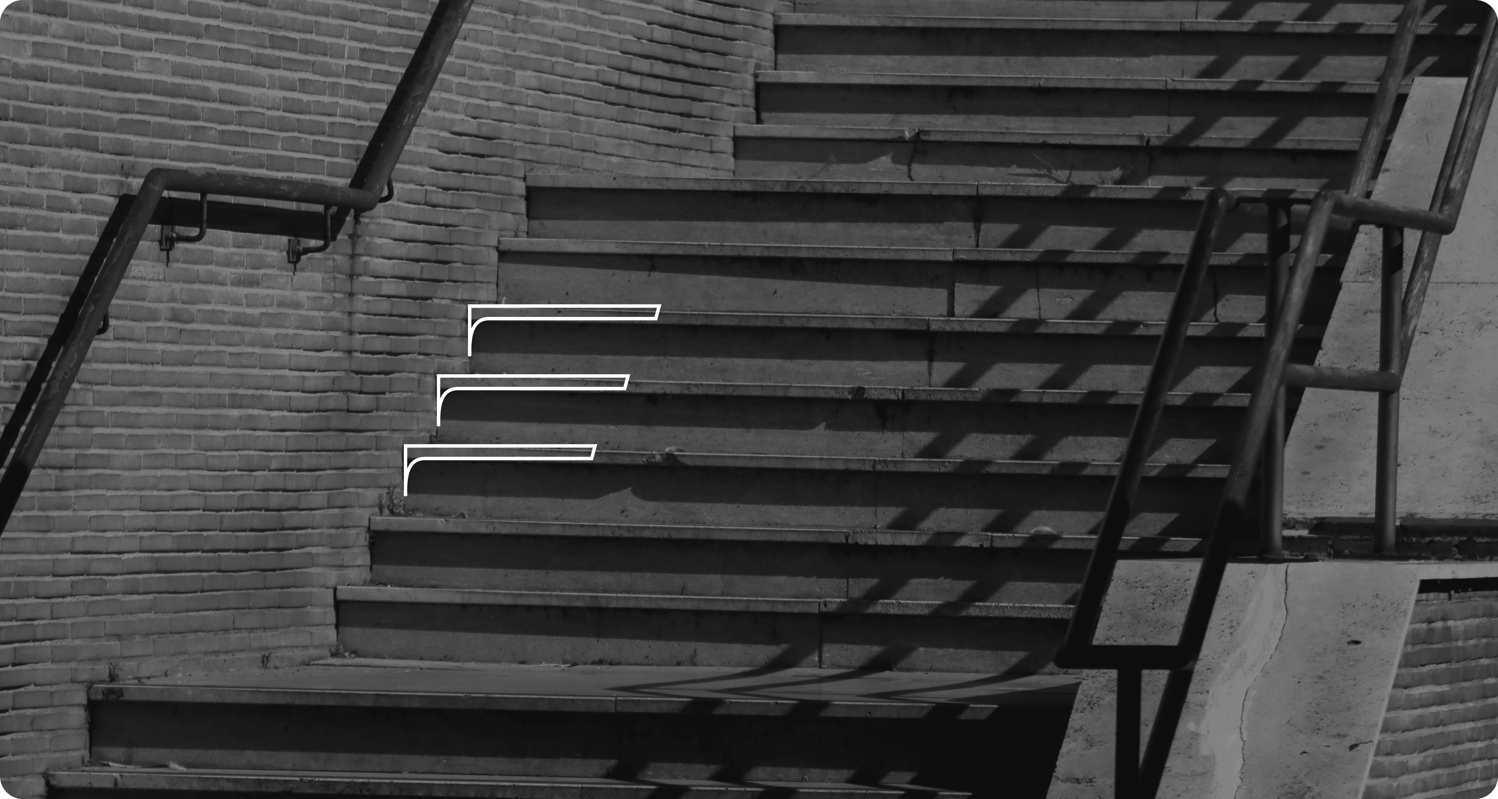
Each line represents:

The result is a mark that feels simple, memorable, and deeply connected to the brand’s core idea.
Less Color. More Intent
The identity is built entirely in a monochrome palette, allowing the focus to remain on form, structure, and composition.
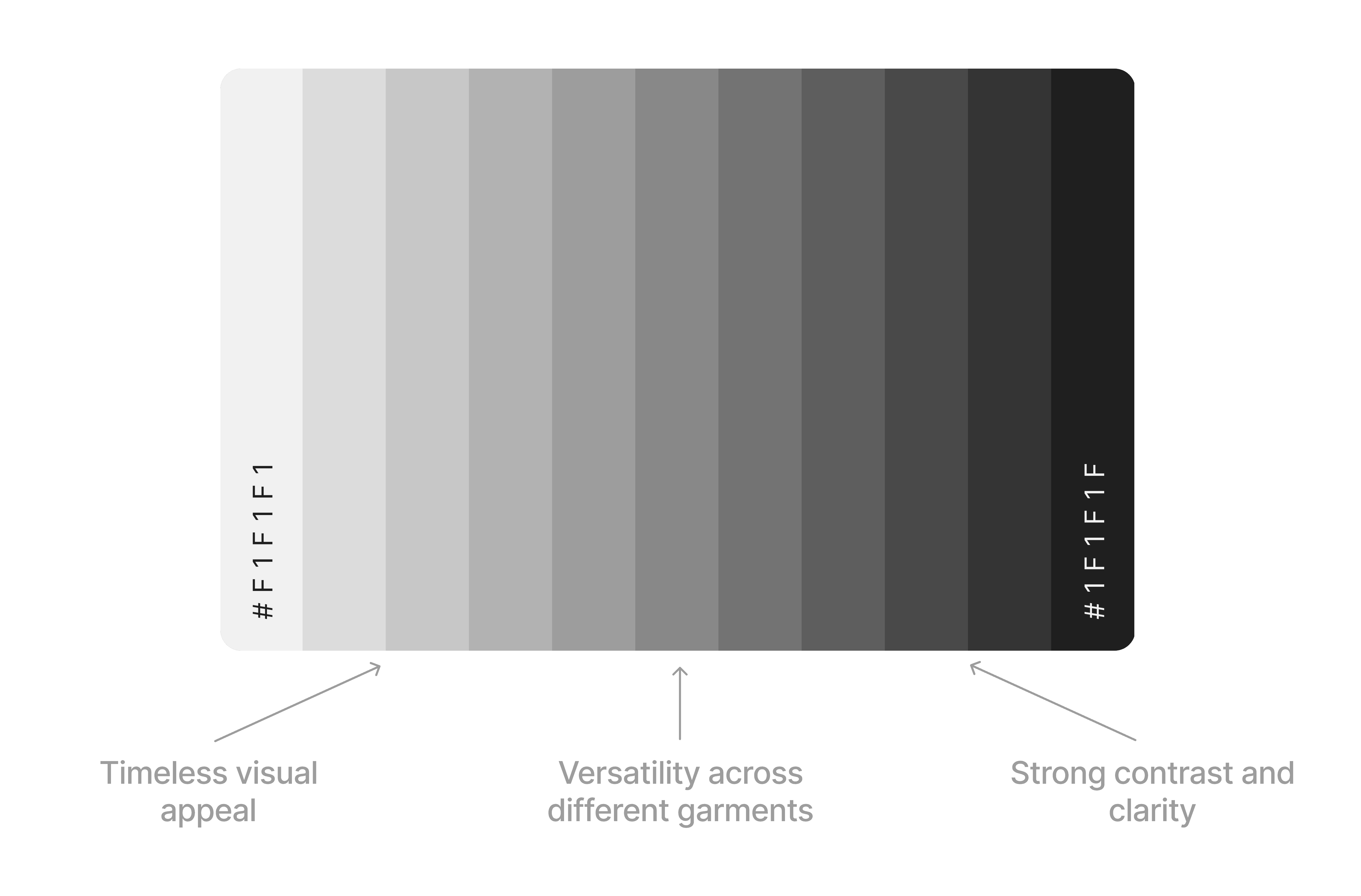
This approach aligns with modern streetwear aesthetics, where simplicity becomes the statement.
Modern Form Meets Function
The primary typeface, Monument Extended, was chosen for its bold and distinctive structure.
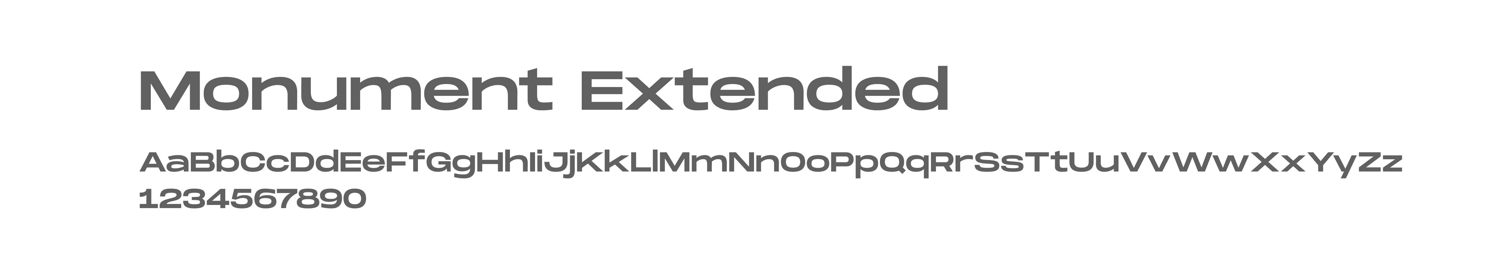
Its wide proportions and sharp geometry give the brand a strong, fashion-forward presence, often seen in contemporary streetwear and editorial design.
To balance this, Inter was selected as the secondary typeface.

Designed for clarity and readability, Inter supports the system across digital and informational content, ensuring the brand remains clean and accessible without losing its visual identity.
Together, the typography system blends expression and function, reflecting both the creative and practical sides of the brand.
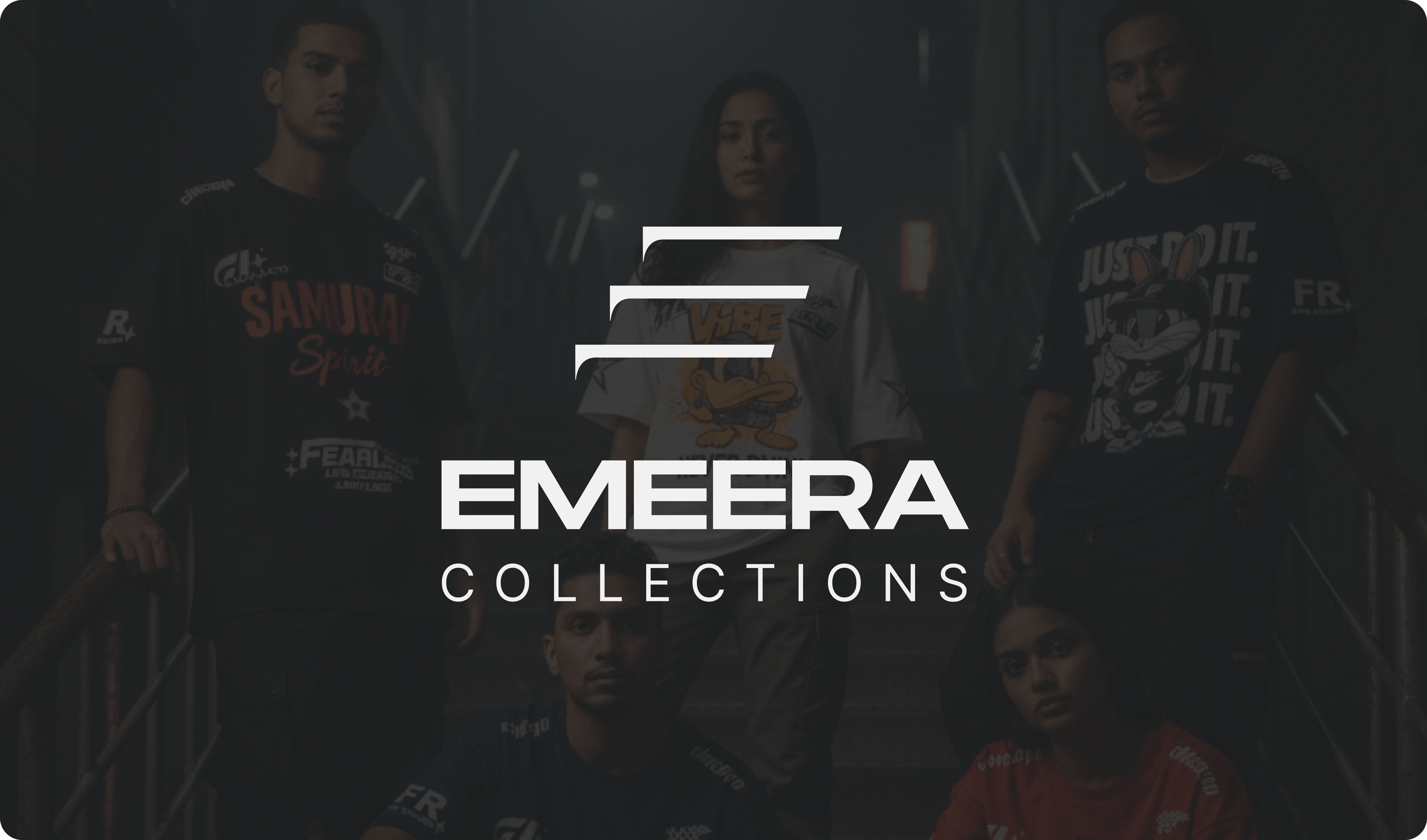
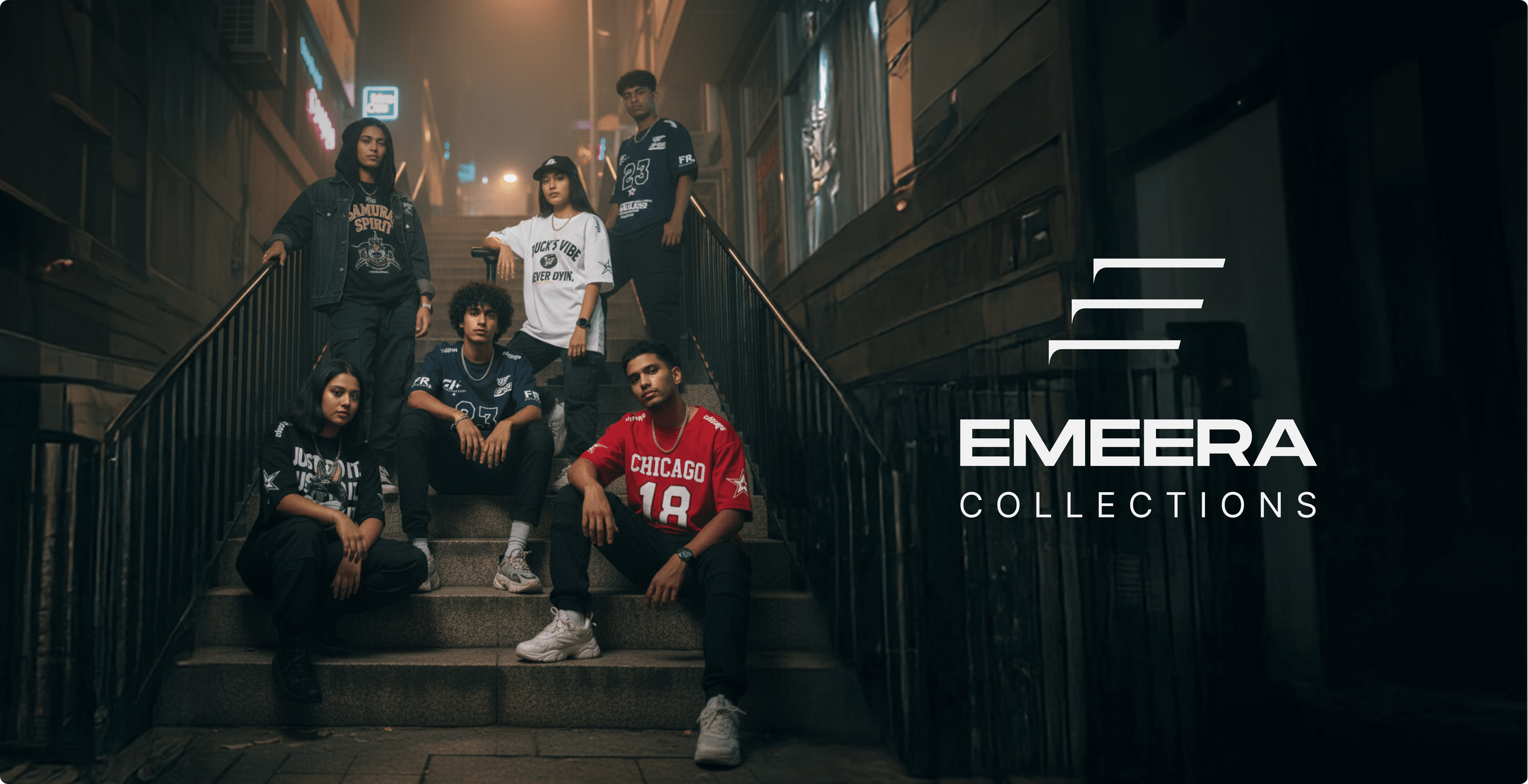
Identity in Action
The identity was designed to adapt seamlessly across different touchpoints — from apparel to digital platforms.
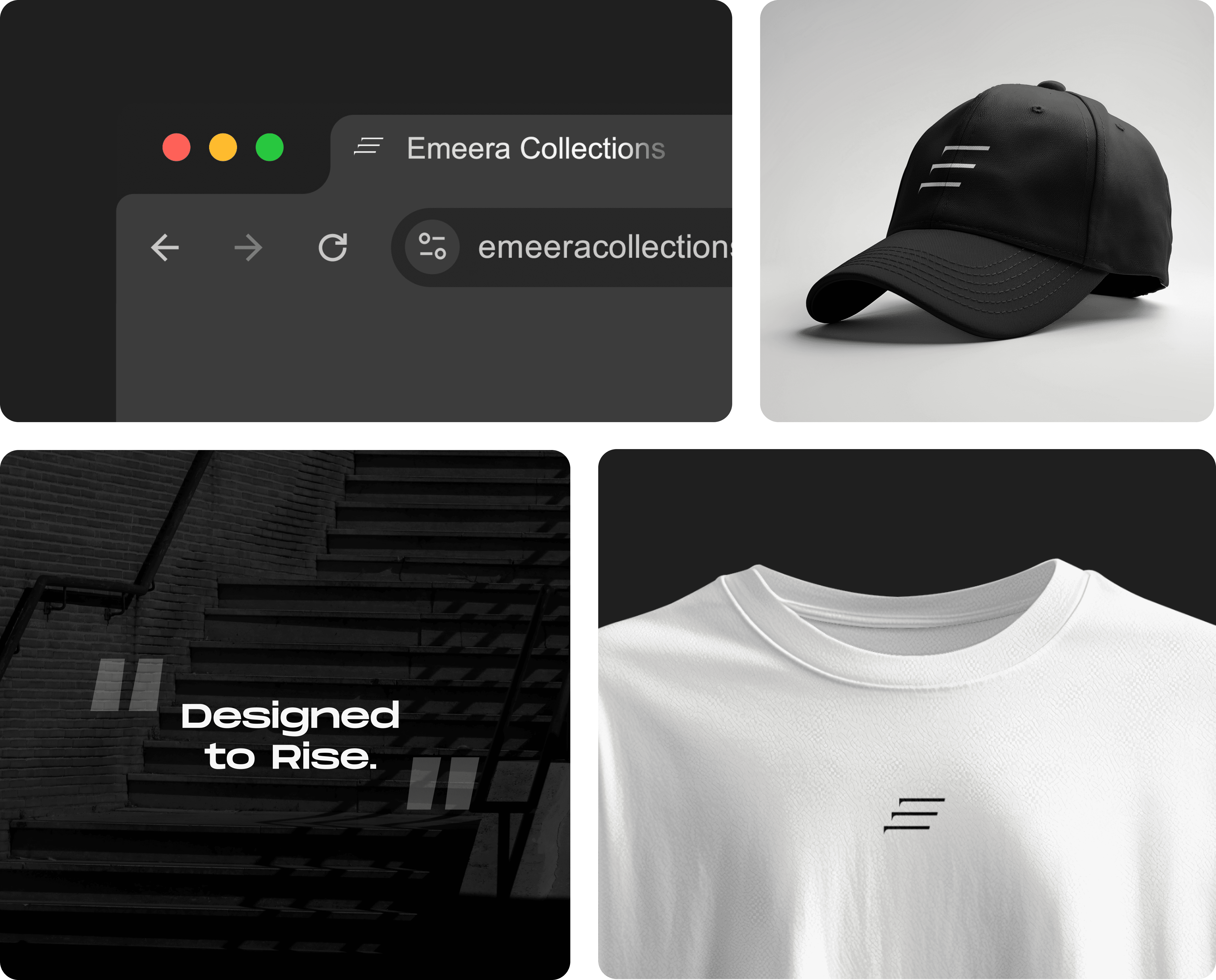
Every application maintains the same principles:
Clean composition
Strong contrast
Minimal execution
This ensures consistency while allowing the brand to remain flexible and scalable.
The Challenge
The project required balancing simplicity with meaning. Key challenges included:
Moving away from a generic AI-generated starting point
Creating a symbol that feels minimal yet recognizable
Designing for real-world applications like fabric and embroidery
Maintaining a strong identity without relying on color
Each decision was guided by the need to create a brand that feels intentional, modern, and adaptable.
A Brand That Moves Forward
Emeera Collections is more than a visual identity — it is a direction.
Built on the idea of rising, the brand reflects a mindset of growth, confidence, and continuous progression.
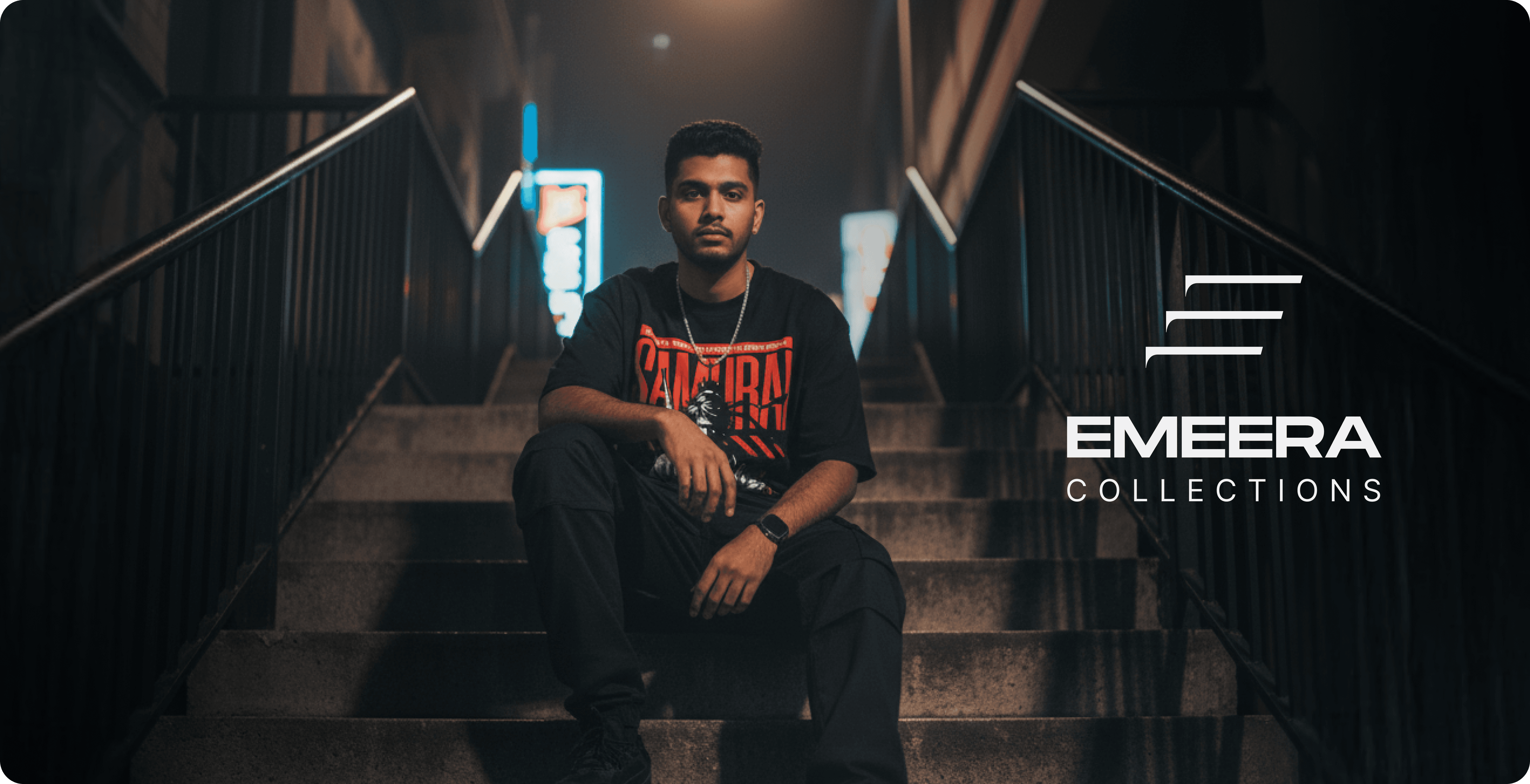
Through minimal design and strong conceptual grounding, the identity positions Emeera as a modern streetwear brand ready to evolve with its audience.