Levico - Precision in Motion
Building an international lubricant brand designed for performance, protection, and global recognition.
Levico is a Subsidiary brand of Levi Marketing Pvt Ltd, an established Sri Lankan automotive oil brand preparing to expand into the international market, seeking a refreshed visual identity to reflect its evolving ambitions. Our task was to create a brand identity that feels powerful, modern, and globally competitive while remaining simple enough to work across packaging, digital platforms, and physical applications.

Client:
Levi Marketing
Scope:
Logo Design and Branding
Year:
2026
Where the Journey Started
Levi Marketing Pvt Ltd approached us with a clear ambition - to update their brand that could compete not only locally, but also in international markets. The brand needed to represent performance, reliability, and engineering precision, while maintaining a modern identity that could stand confidently beside global oil brands.
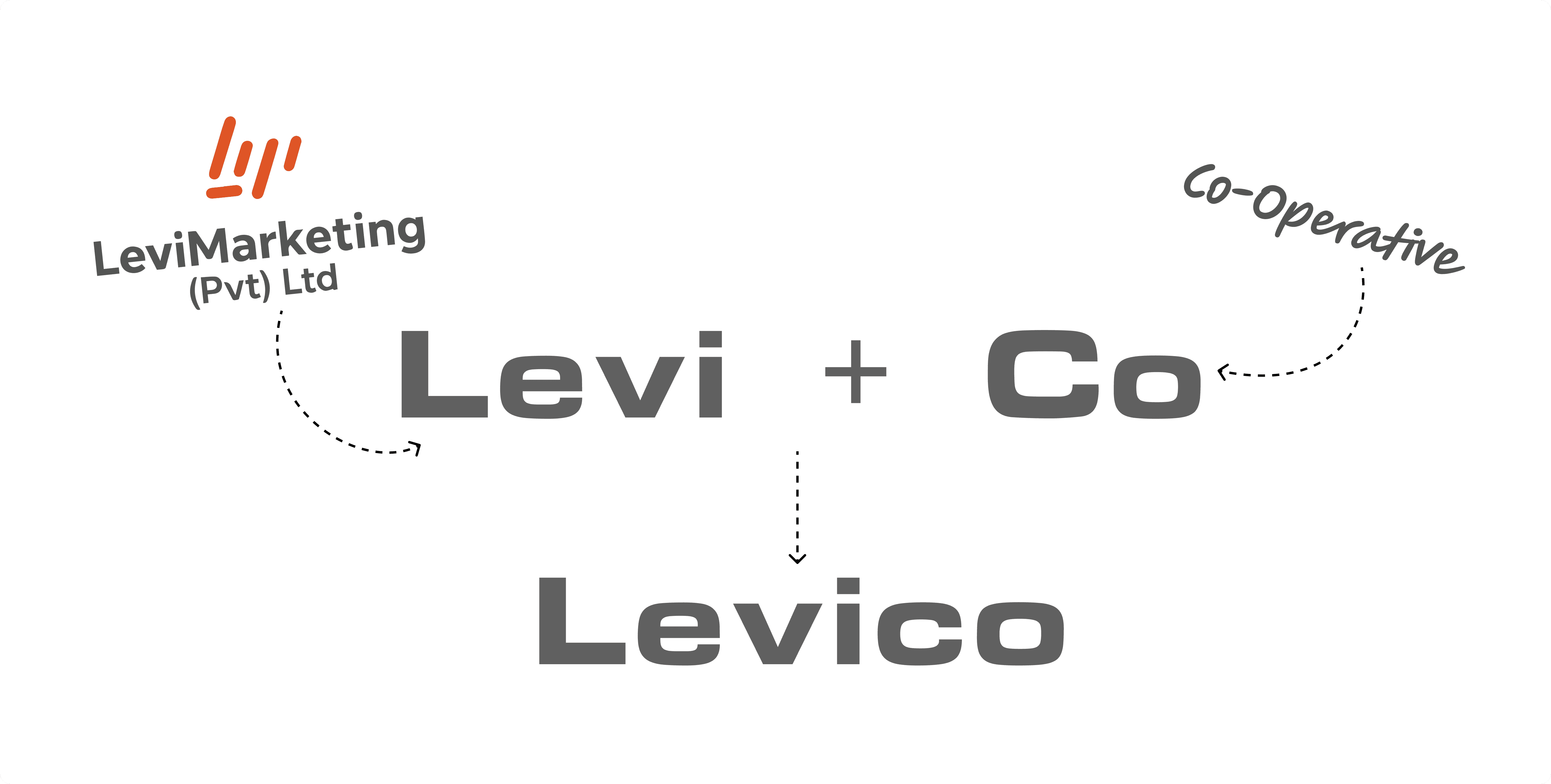
The name Levico originates from the parent company name Levi, combined with the idea of a cooperative brand extension — forming a name that feels both corporate and scalable for global markets.
Understanding the Industry
Before starting the design process, we explored the visual language commonly used in lubricant brands. Most oil brands rely heavily on generic mechanical symbols such as gears, pistons, or literal oil droplets. While these elements communicate the industry, they often lack uniqueness and global brand recognition.
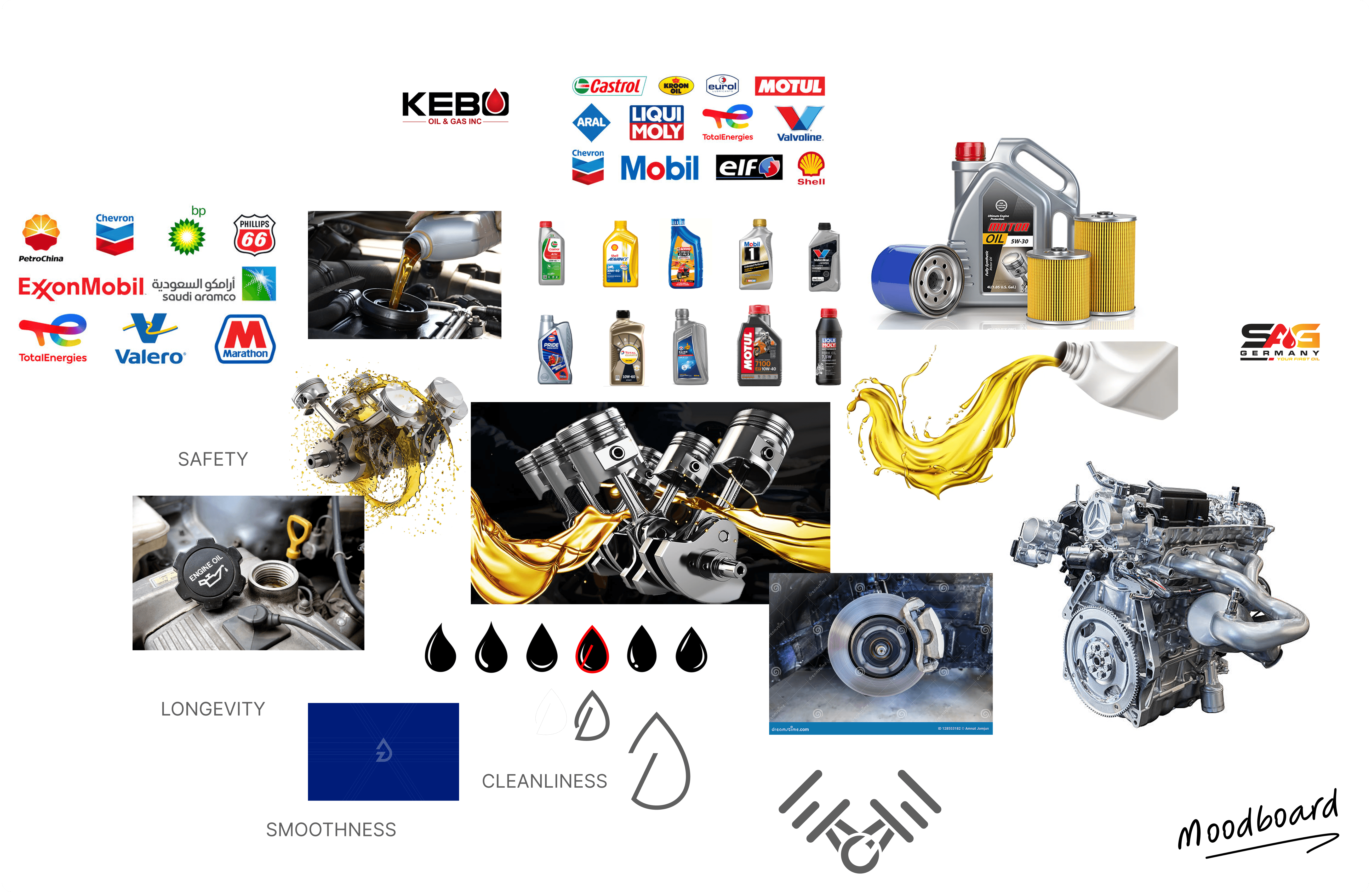
Our goal was to create a mark that represents motion, lubrication, and protection — without relying on predictable visuals.
Defining the Brand Personality
The identity for Levico was built around three core attributes:
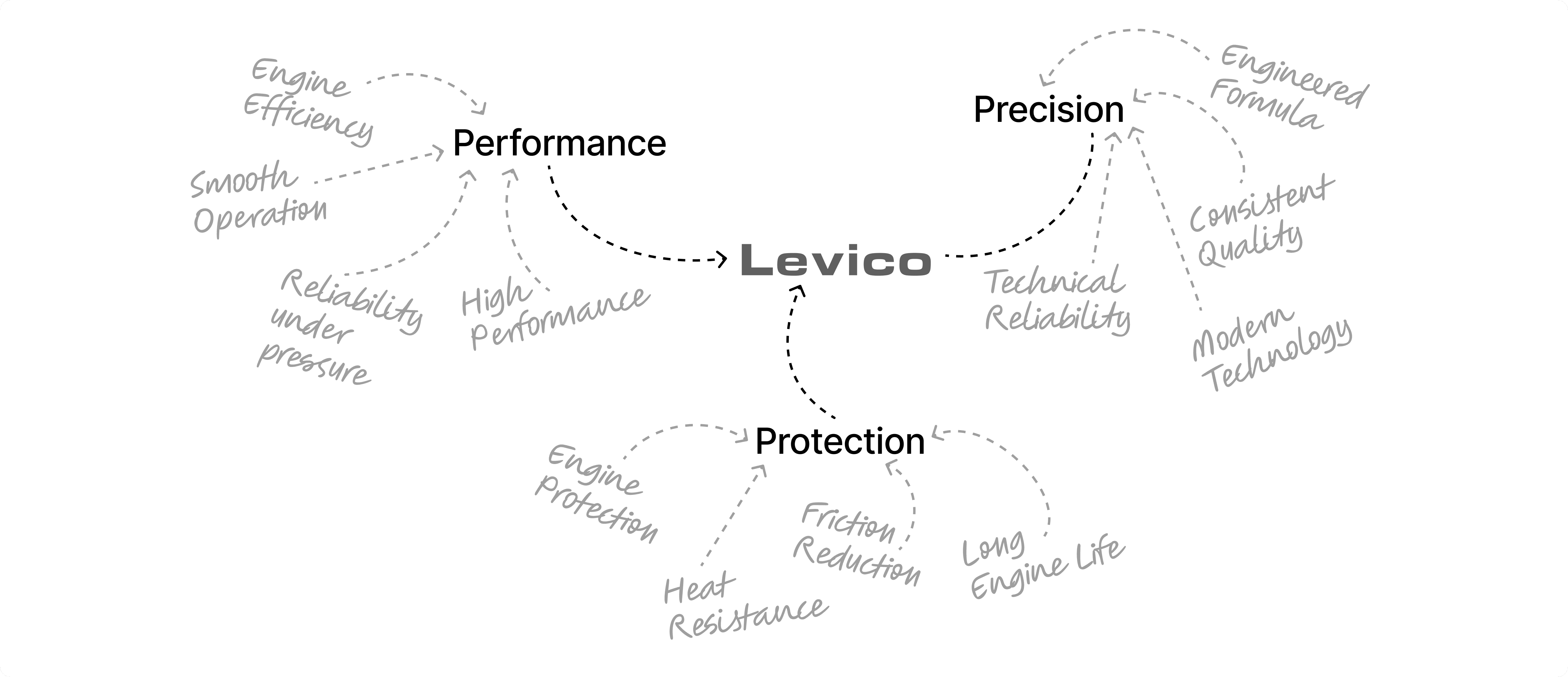
Together, these qualities formed the foundation of a brand that feels premium, reliable, and performance-driven.
Exploring the Possibilities
During the early stages, multiple logo directions were explored to find the right balance between symbolism and simplicity.
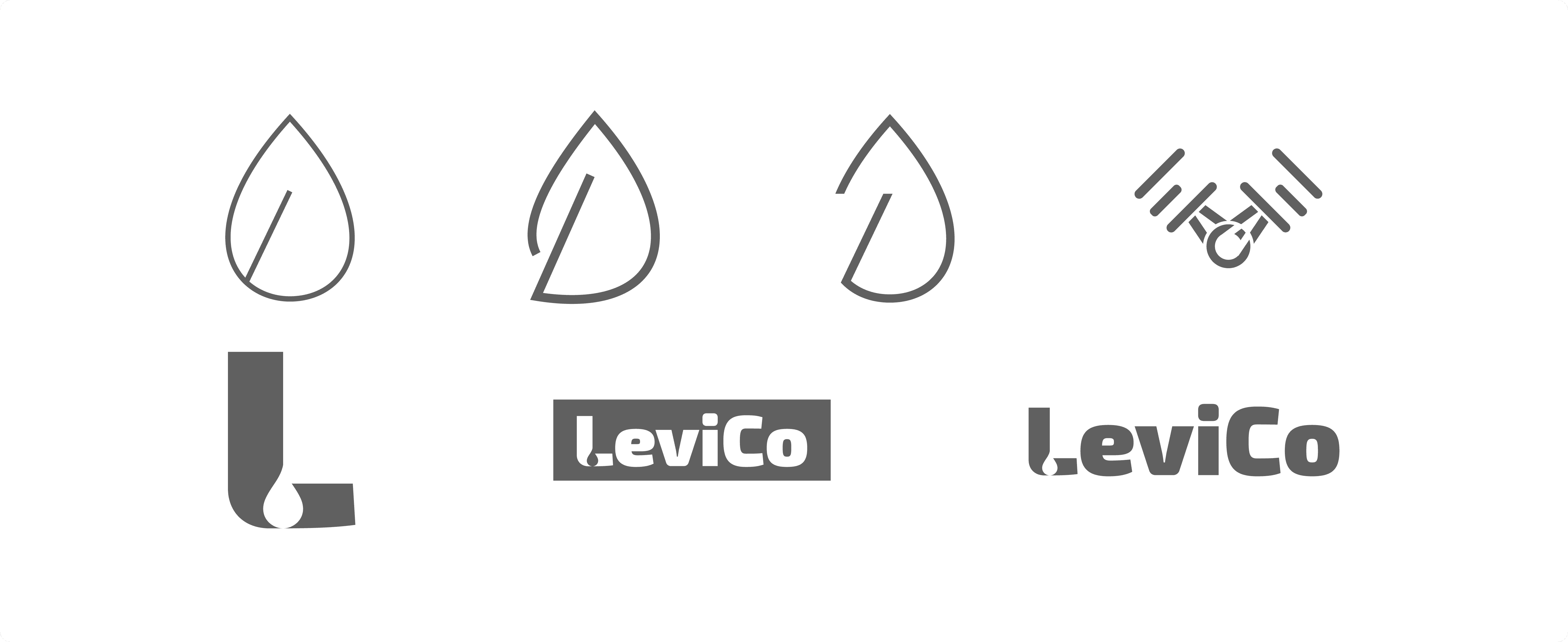
The challenge was to create something that could:
Avoid generic lubricant visuals
Feel modern and internationally competitive
Work clearly on small packaging elements like bottle caps
Maintain strong visibility across digital and physical media
After exploring several concepts, the design began evolving toward a fluid symbol inspired by motion and lubrication.

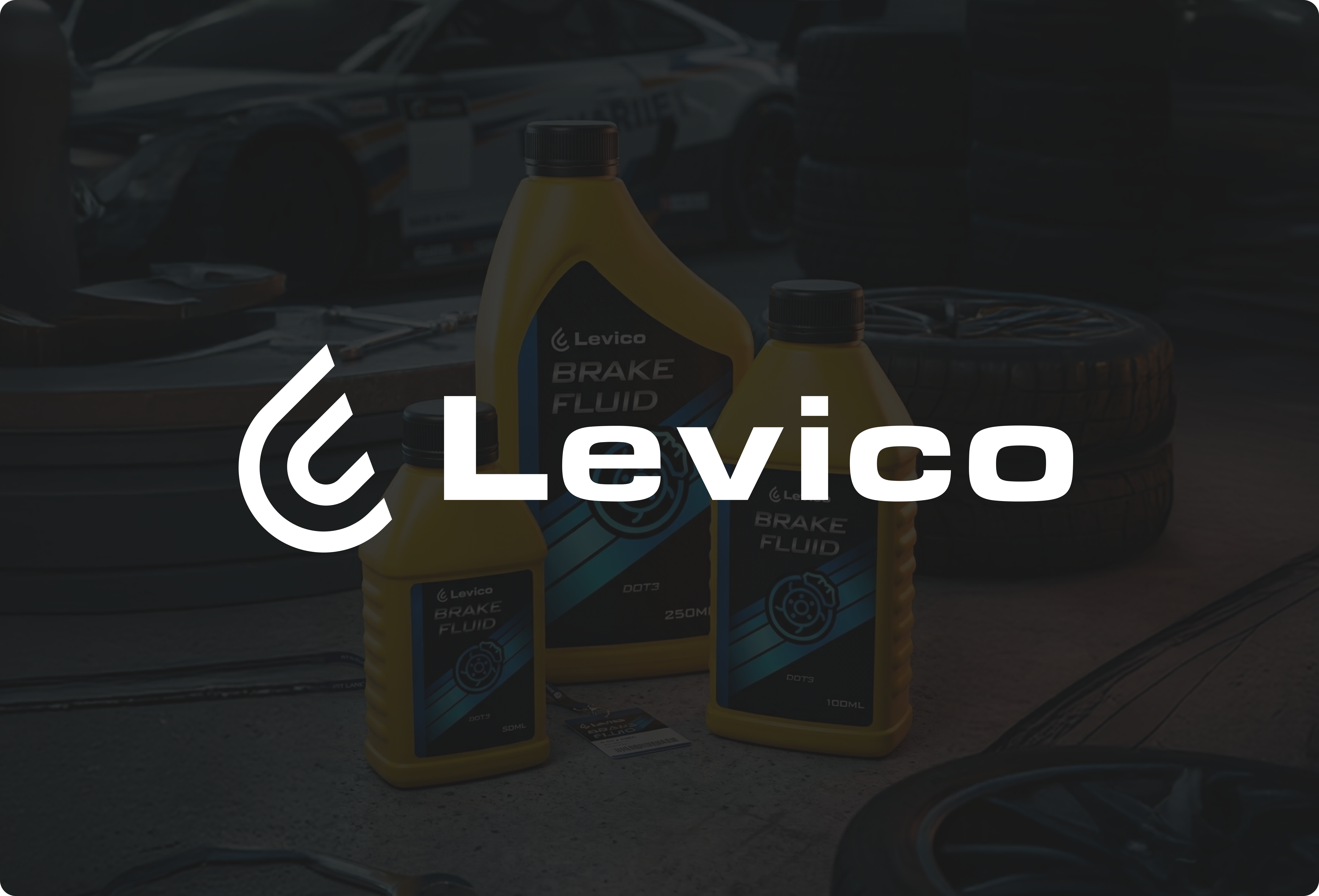
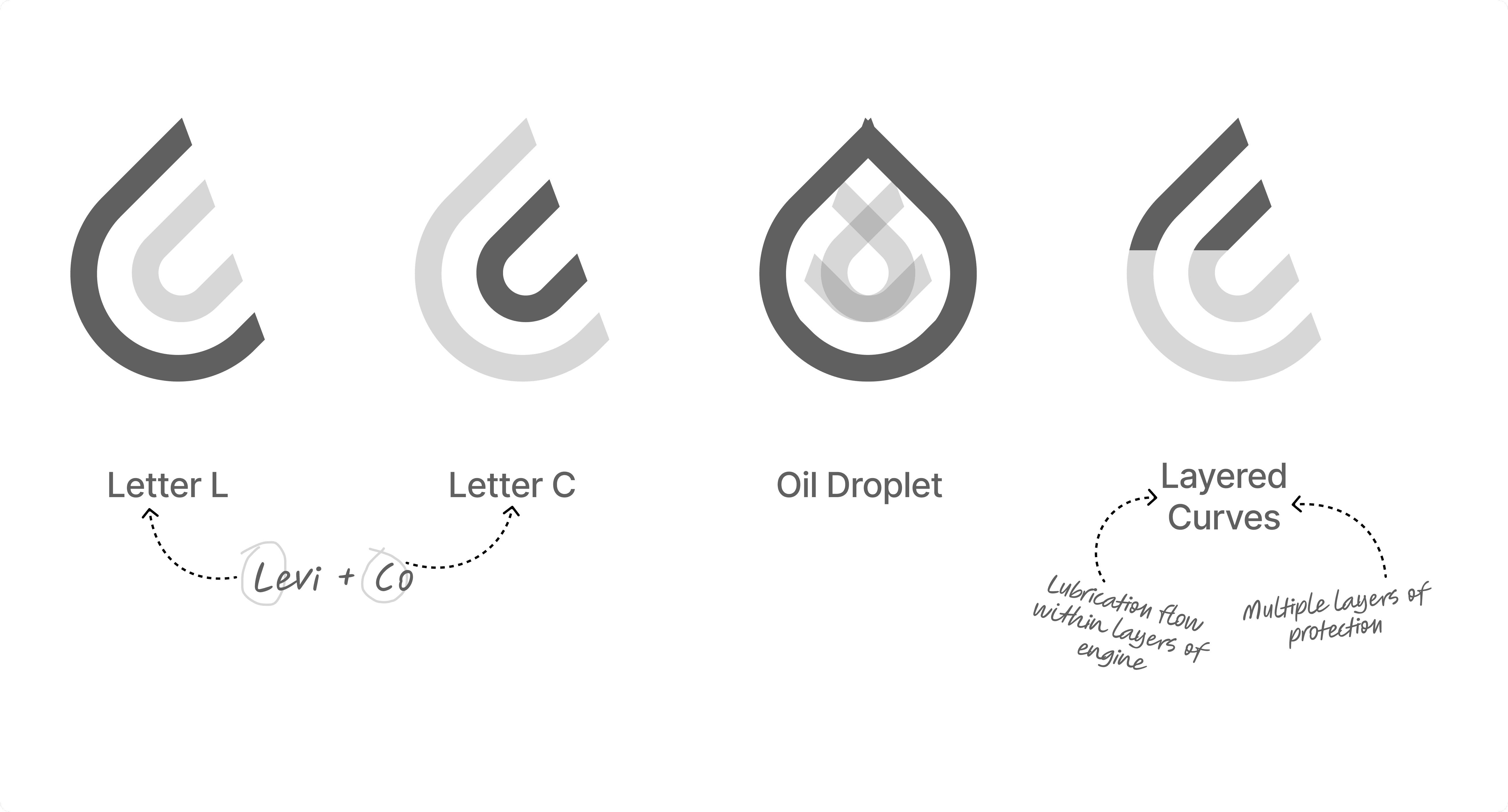
Designing the Symbol
The final symbol is inspired by the fluid movement of an oil droplet, carefully shaped to represent both motion and brand identity.

The form subtly integrates the letters L and C, referencing the brand name Levico, while maintaining a smooth and dynamic structure that reflects lubrication flow. The layered curves symbolize, Lubrication flow within an engine and Multiple protection layers offered by the oil.
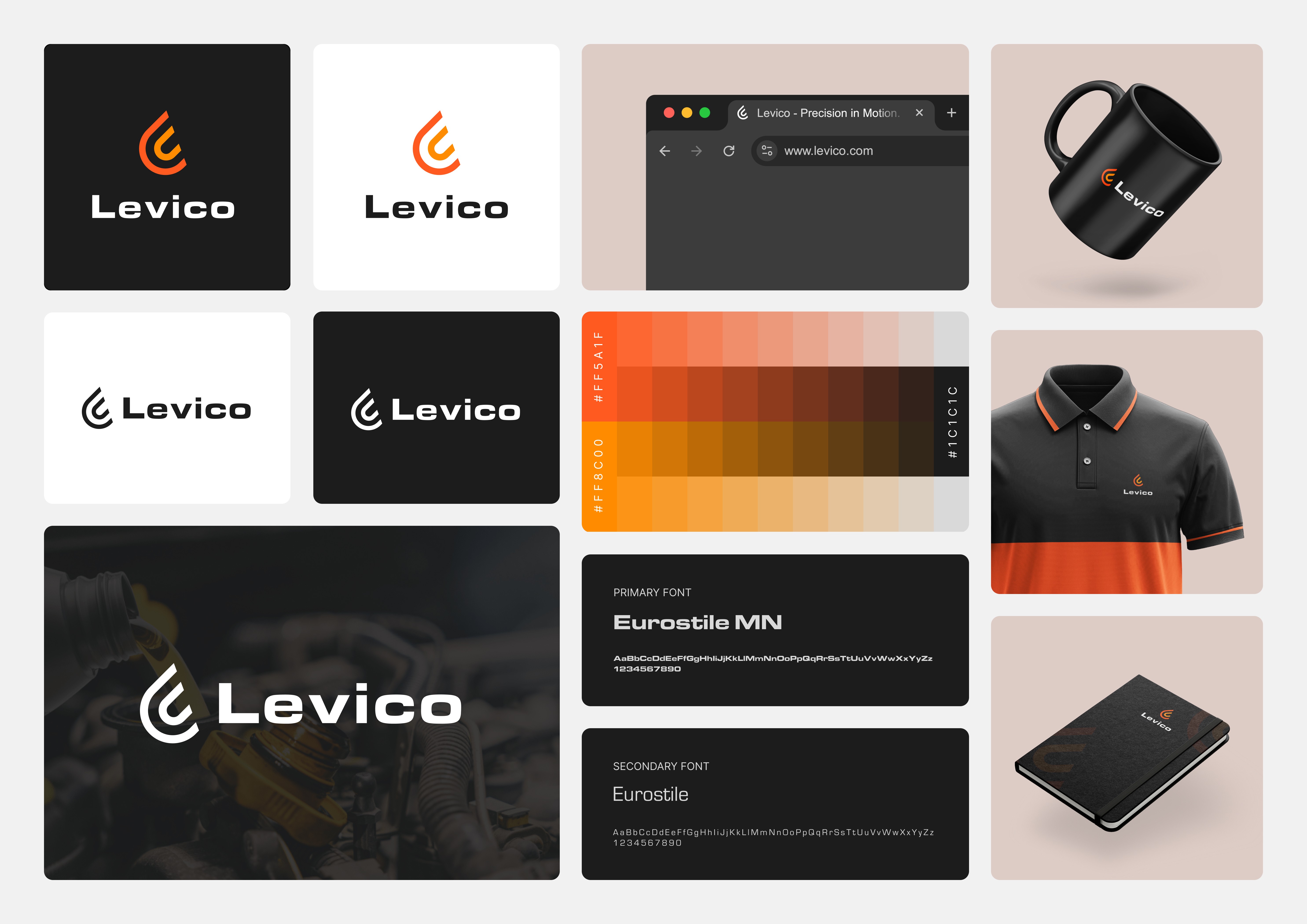
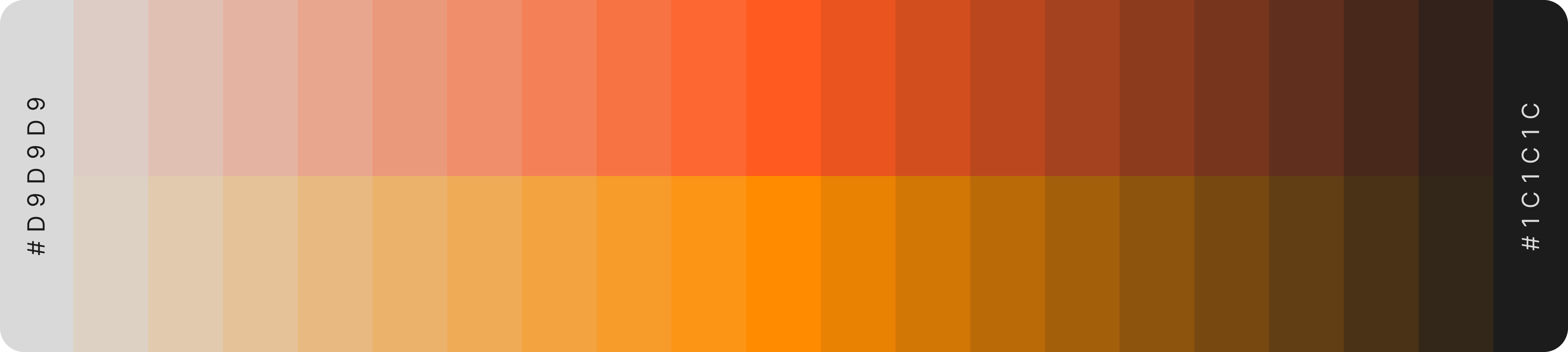
Color That Carries Energy
The color palette was built around a bold orange tone, chosen for both strategic and symbolic reasons.
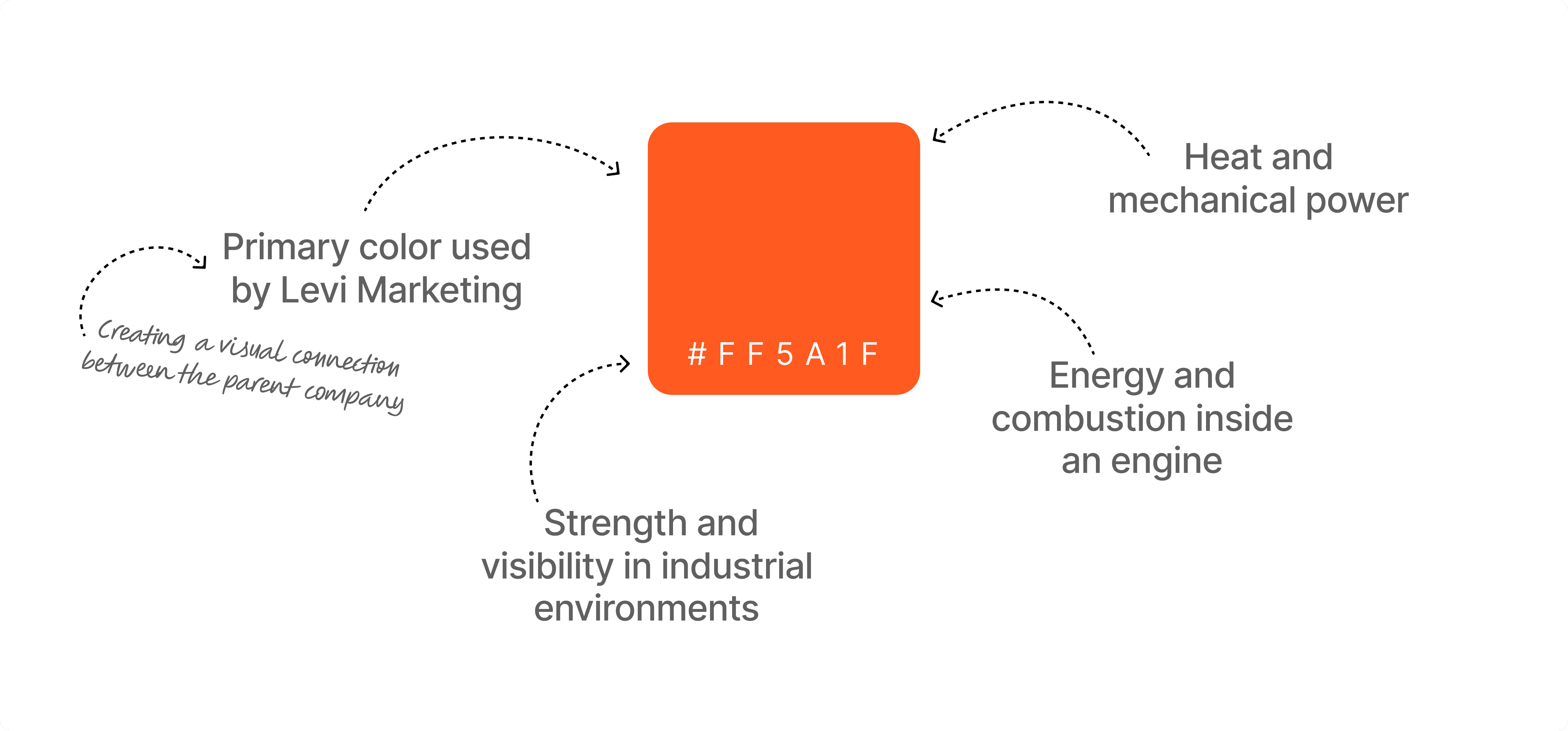
To support the primary orange, a deeper accent tone #FF8C00 was introduced.
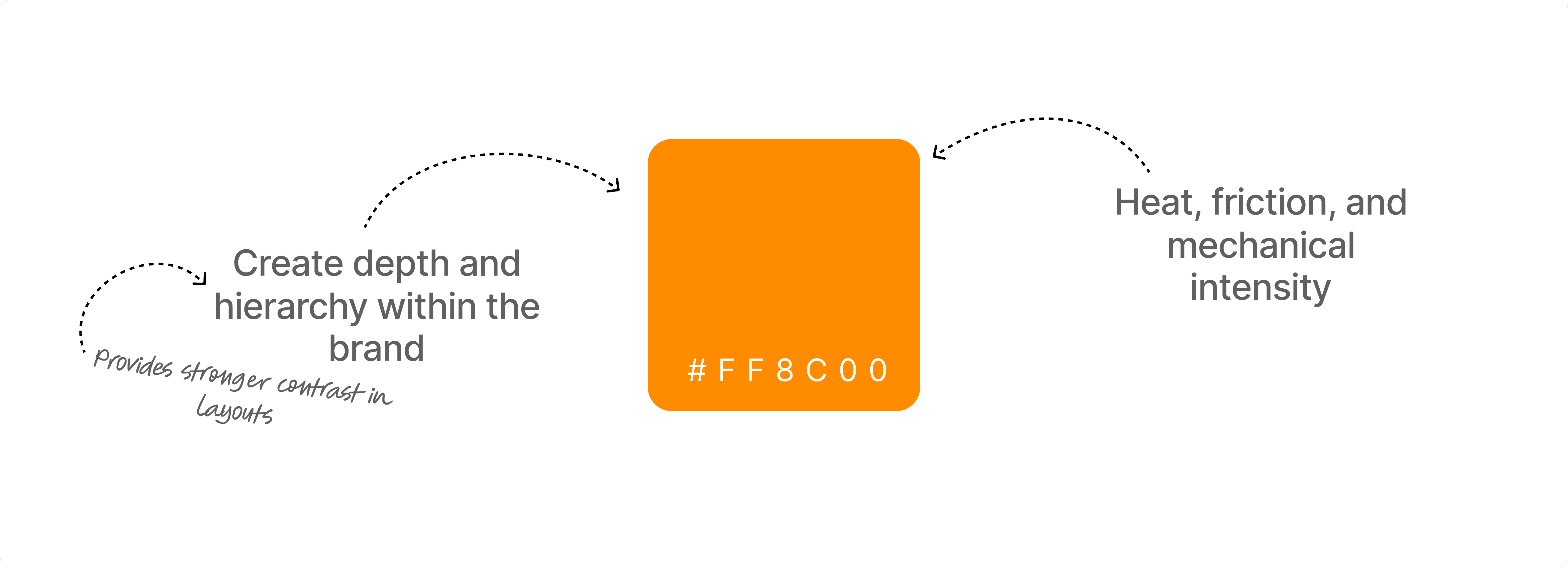
Together with deep blacks and neutral tones, the palette forms a bold industrial color system that feels powerful, modern, and performance-driven.
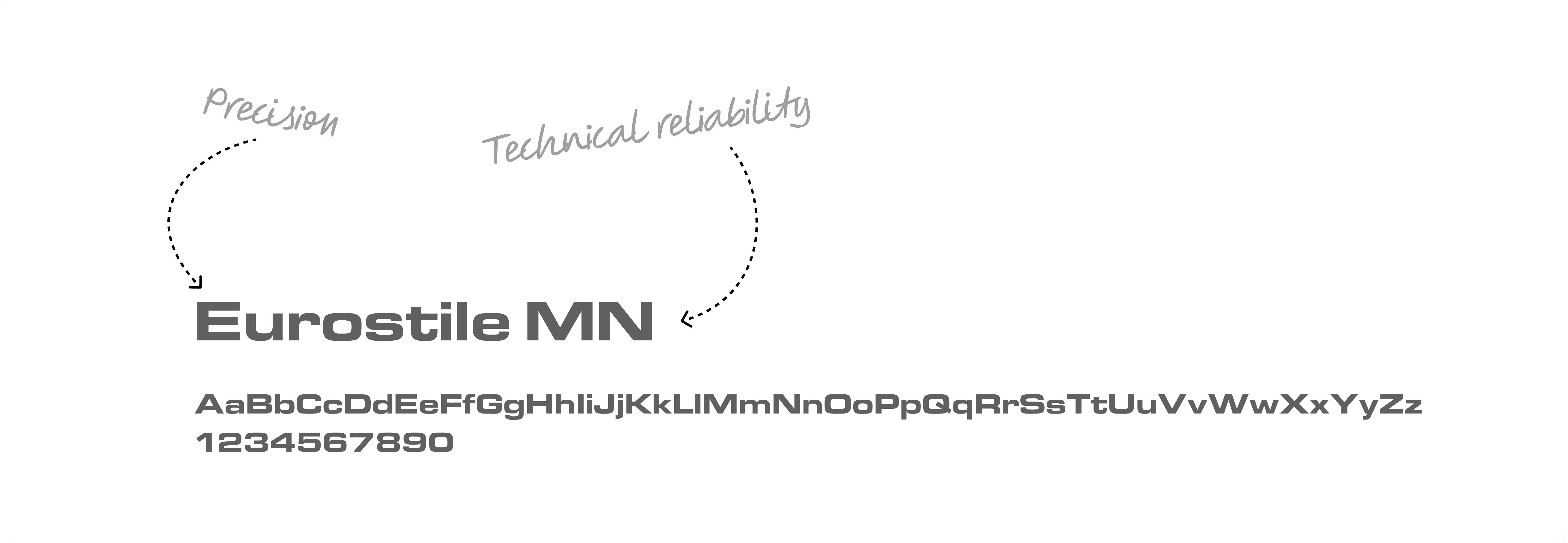
Engineering Precision in Type
For the primary wordmark and headings, we selected Eurostile MN, a typeface widely associated with technology, engineering, and industrial design.
To support the primary typeface, Eurostile was chosen as the secondary font.
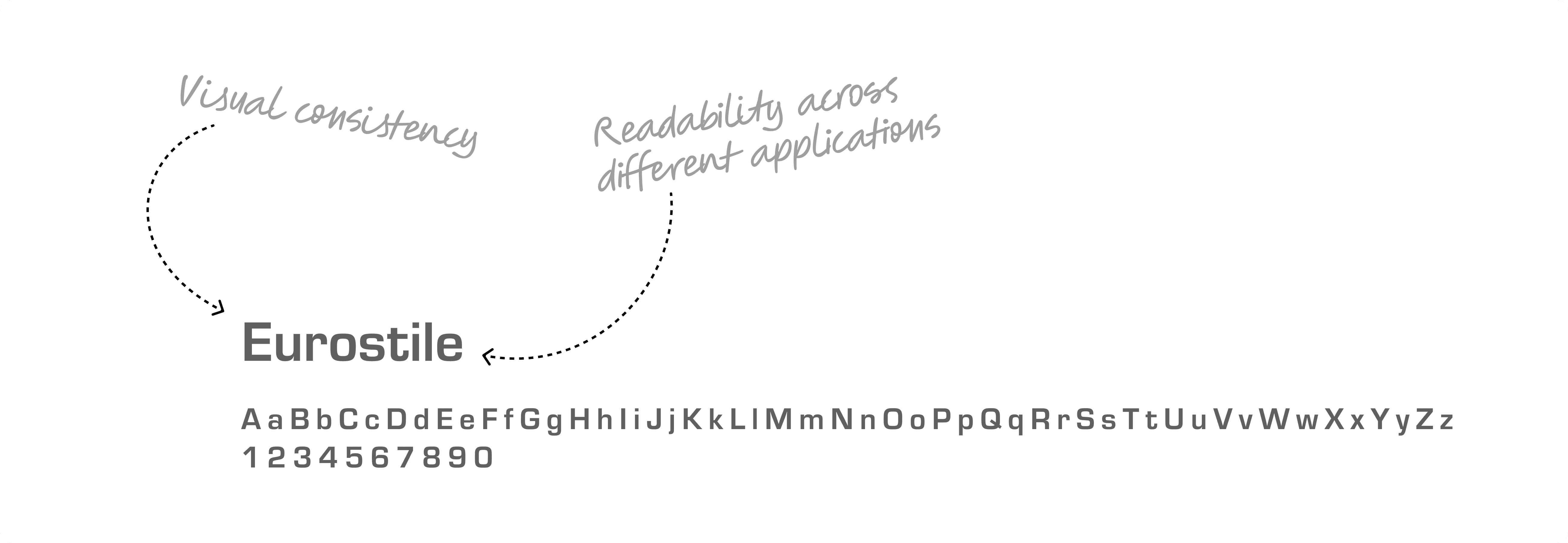
Together, the typography system reflects clarity, precision, and modern engineering aesthetics, reinforcing Levico’s positioning as a reliable and performance-oriented lubricant brand.
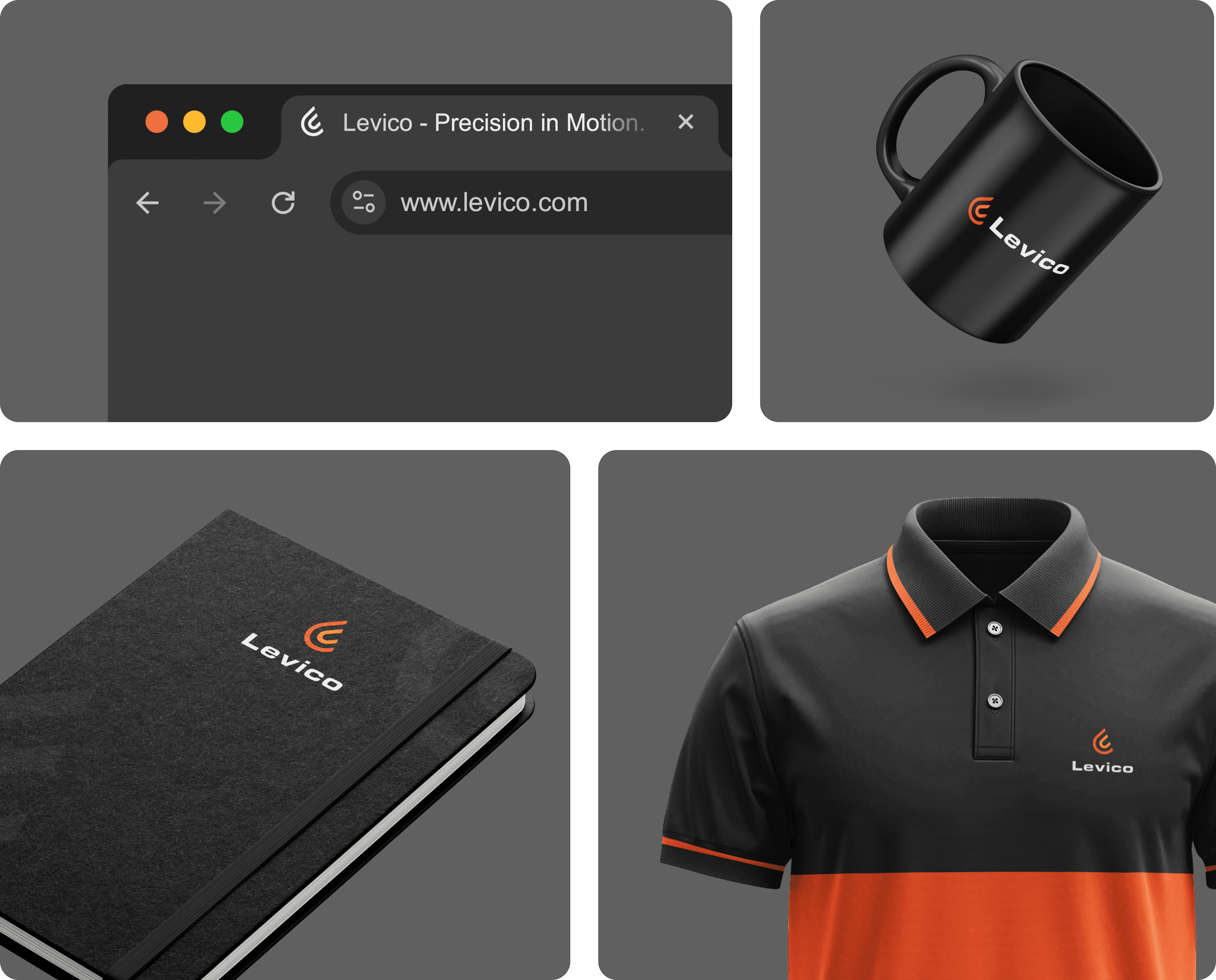
Identity in Action
Once the visual identity was established, the next step was ensuring the brand performs consistently across different real-world applications.
A Brand Built for Motion
Levico was designed as a lubricant brand ready to compete in both local and international markets. By combining fluid symbolism, strong typography, and a bold industrial color palette, the identity communicates the core values of the brand:

The result is a modern automotive brand that feels confident, scalable, and ready for global expansion.